Brand strategy

NA Form House

Recognition is a form.

Scroll
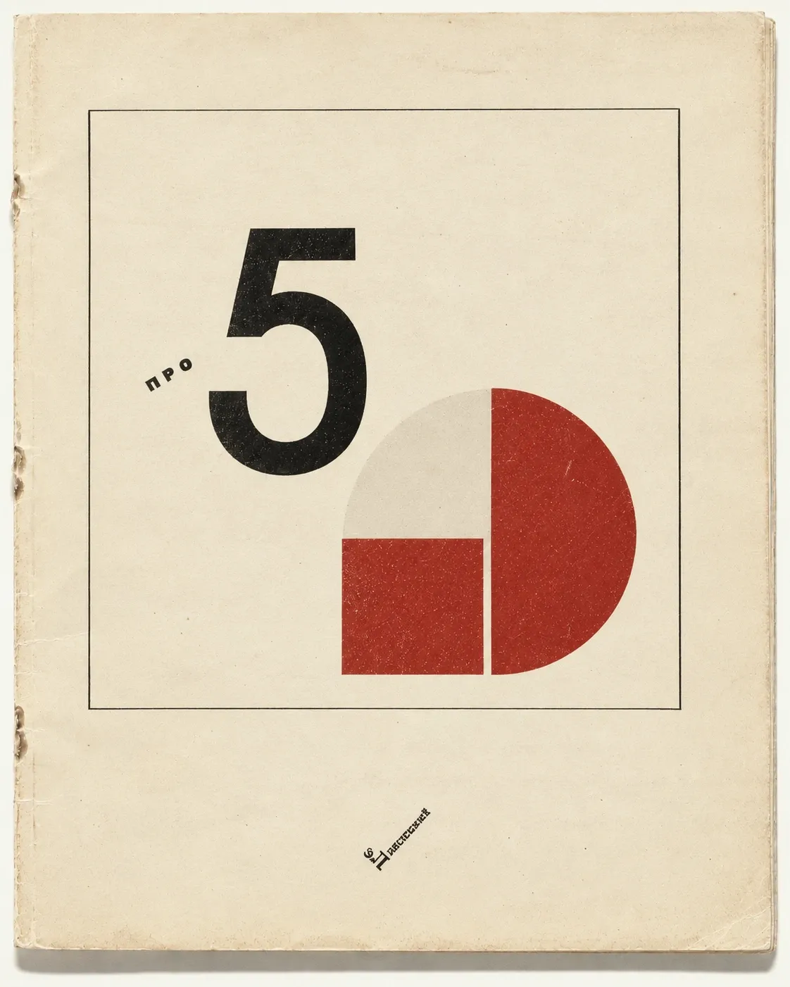
A cream book cover with a large black numeral 5 and red and grey geometric shapes.
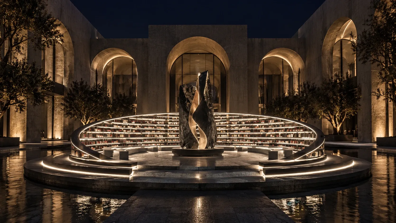
A stone courtyard at night, a twisted dark sculpture ringed by lit curved bookshelves over water.
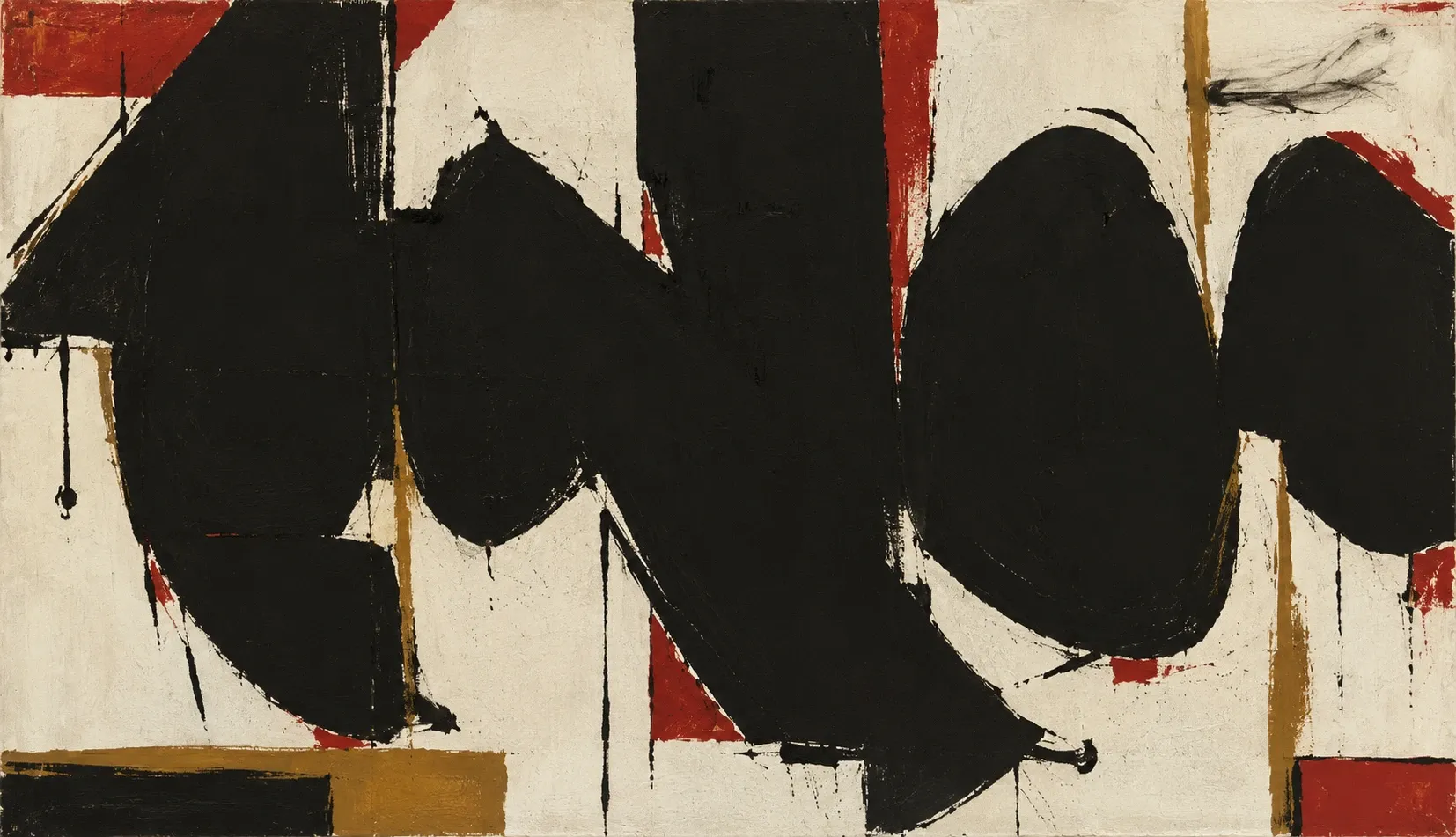
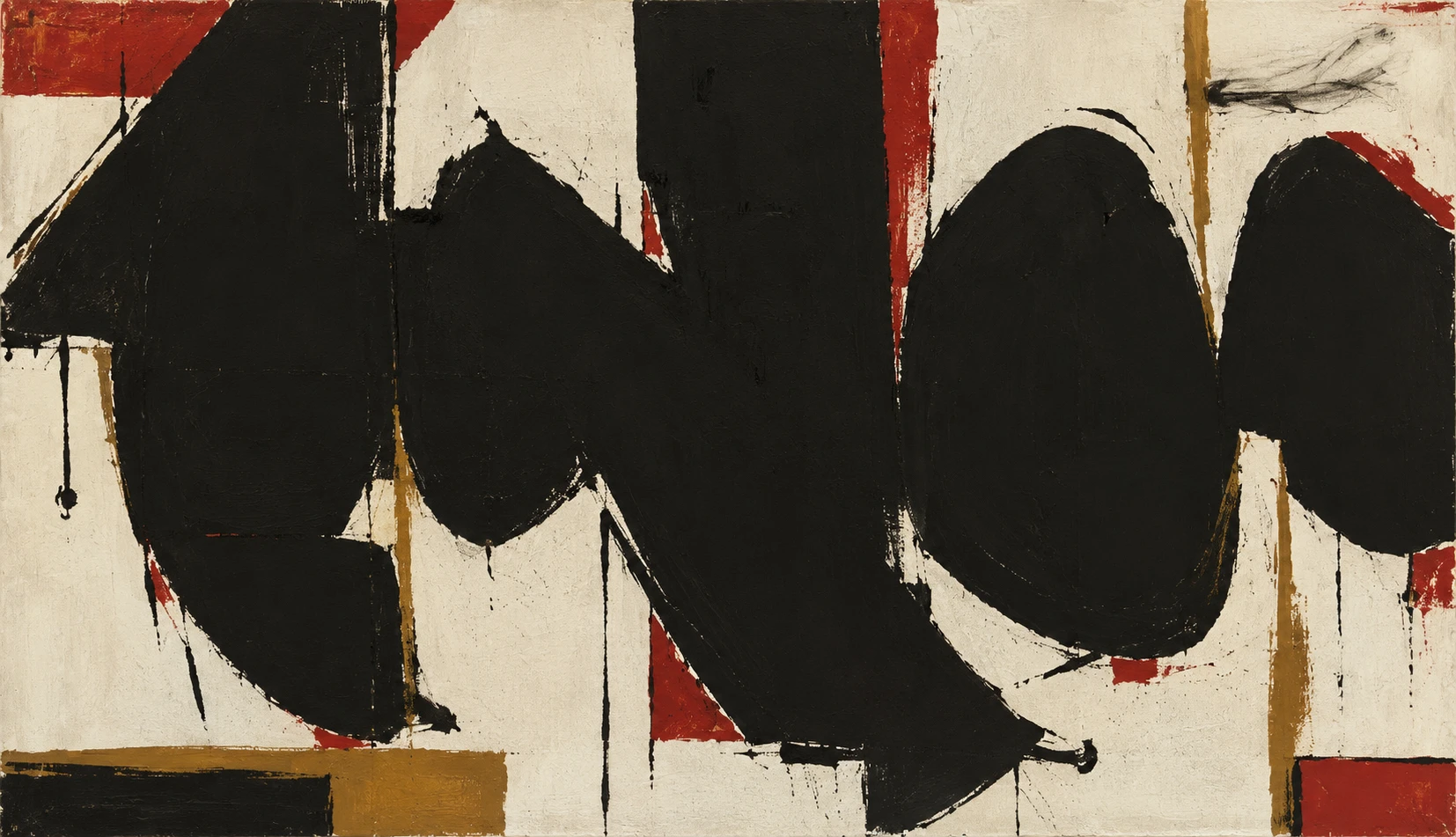
An abstract painting of heavy black forms with red and ochre bands on cream canvas.
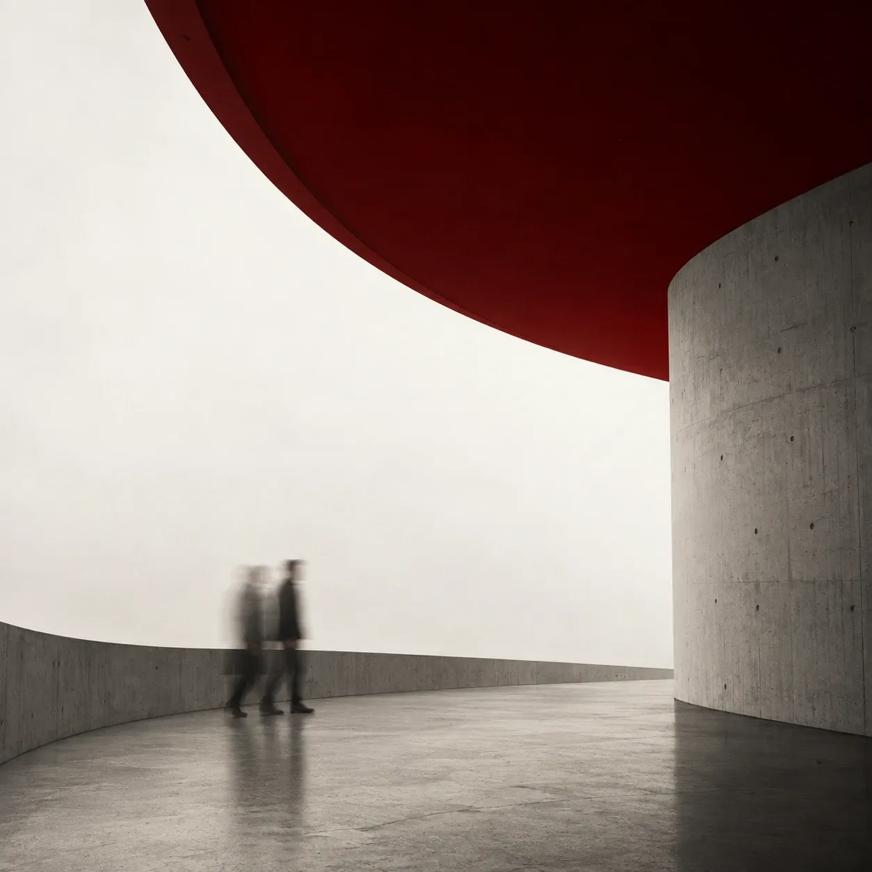
Two blurred figures walking a curved concrete terrace under a deep red canopy, in fog.
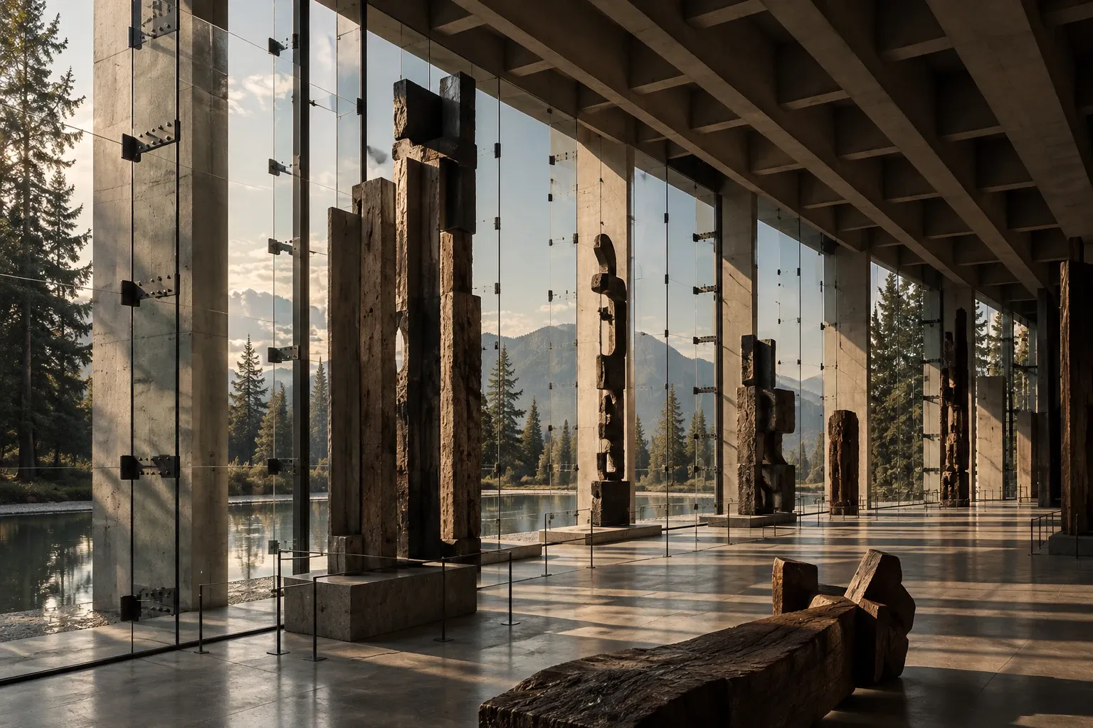
A concrete gallery hall of tall carved wooden sculptures, glass walls opening onto forest, water and mountains.
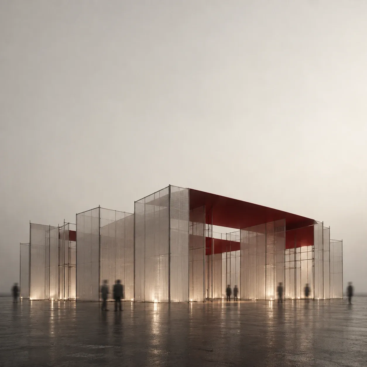
A translucent mesh pavilion with a red roof in fog, lit from below, figures standing around it.

For the ones who have outbuilt their brand.

The work has moved on. The name, the mark and the way it is described have not. NA Form House reads that gap, then rebuilds what is presented until it matches what was built.

The work runs in three stages. A practice can begin at any of them, and each can be the last.

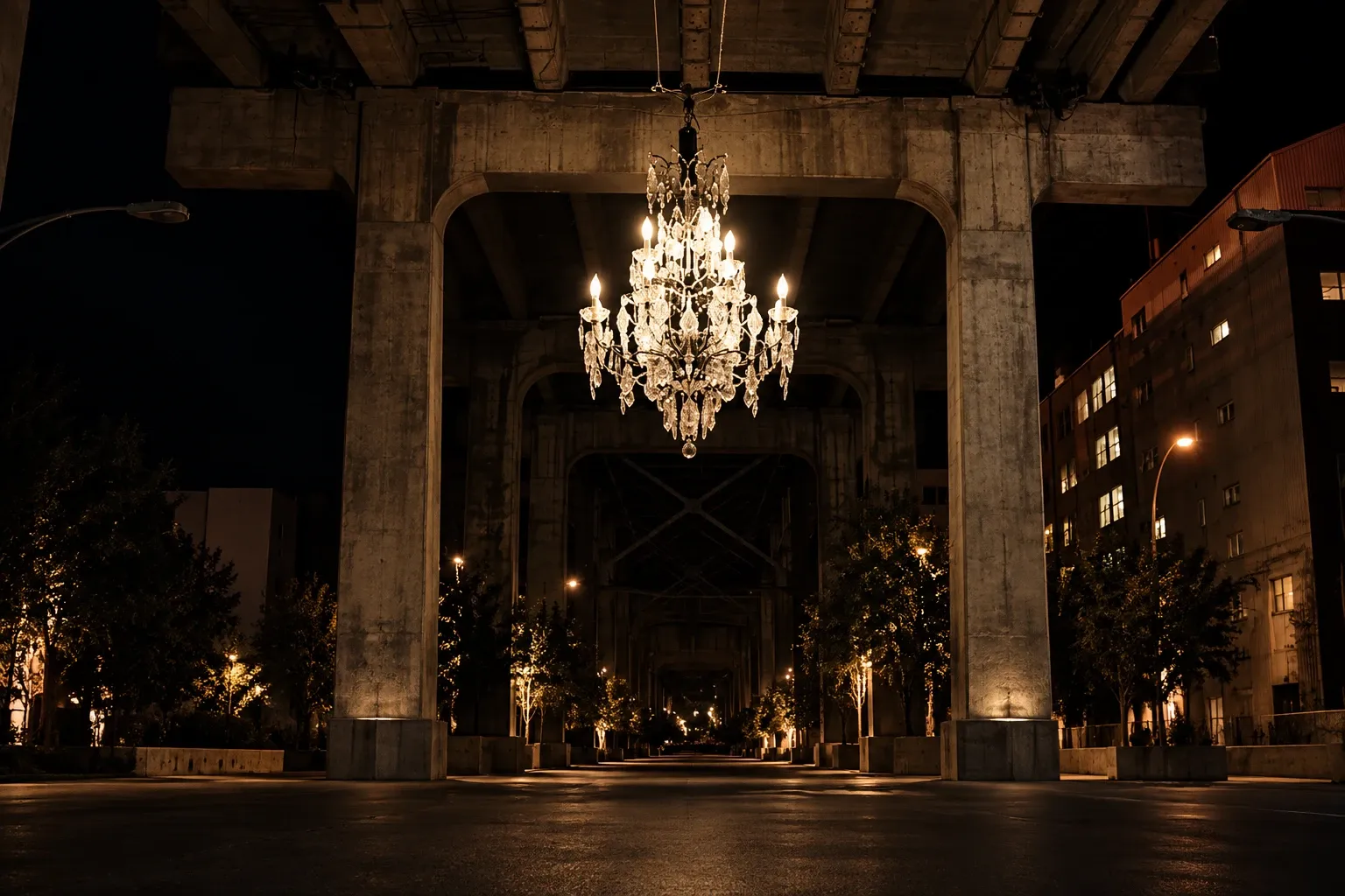
A crystal chandelier hung under a concrete overpass at night, a lit avenue of trees running away beneath it.
  1. The Review · Free

    Send three things: a website, an Instagram handle and the last proposal sent to a client. Within five days a letter arrives, written by a person, with three findings: the places where what is built and what is said have come apart. No call before, none during. An invitation to talk at the end, if wanted.

    Have your brand read
  2. The Reading

    A full account of the brand as it stands and what it should become. Delivered as a report, a recorded walkthrough and one working session where the decisions are made together. It closes with a letter: the scope of a Translation, or a note that none is needed yet.

  3. The Translation

    The identity, rebuilt from the Reading. Position, voice, mark, colour, type, stationery, document and presentation systems, delivered as one brand bible. With it, Brand in practice: every project written properly, the proposals rebuilt, and a report on what search and AI say about the practice before and after. Everything lives in the practice's own accounts.

Room 01 · An art gallery · Rebrand, 2026

FOUND

Two decades in the same downtown rooms. Original work by Picasso, Dalí and Chagall on the walls, each print with its certificate, each certificate with its lifetime guarantee. And around all of it, a name, a website and a feed made long before the collection deserved them. The gallery had become one of the most serious rooms in the city, and almost nobody under fifty knew it was there. Collectors found it by accident, or through someone who had.

READ

Every print in the building could prove what it was. The gallery could not. The sign, the site and the social accounts each said something different, and none of them said the one thing that mattered: that this was a place where art history is sold with its papers. The work had outbuilt the brand by about fifteen years.

DECIDED

Treat the gallery the way it treats a print. One voice, one provenance, one standard, from the sign on the door to the caption on a post. Say less, document more, and let the collection carry the room.

DELIVERED

A new identity: name held, mark, colour, type and voice rebuilt. A new website, written and structured around the works and their documentation. The social presence taken over and run to the same standard as the walls. And one evening, planned and hosted by the studio, that brought collectors, designers and neighbours into rooms many of them had walked past for years.

WHAT CHANGED

The gallery is visible again, on purpose. The website now shows the works with their papers, so a collector can check a print before they visit. The feed reads like the walls rather than like a shop. The evening put the gallery in front of people who had never been inside, and the enquiries that followed came from them. The brand finally says what the certificates always said, and it says it everywhere at once.
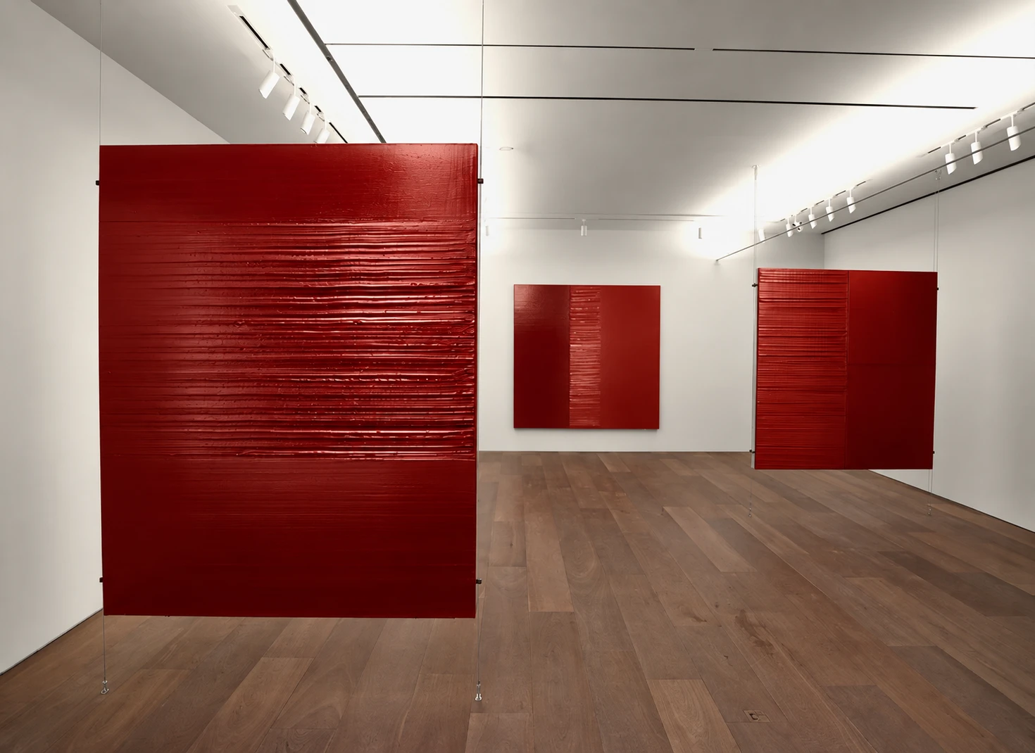
Three textured red panels, two hung on cables in a white gallery with a wooden floor.
An abstract painting of heavy black forms with red and ochre bands on cream canvas.
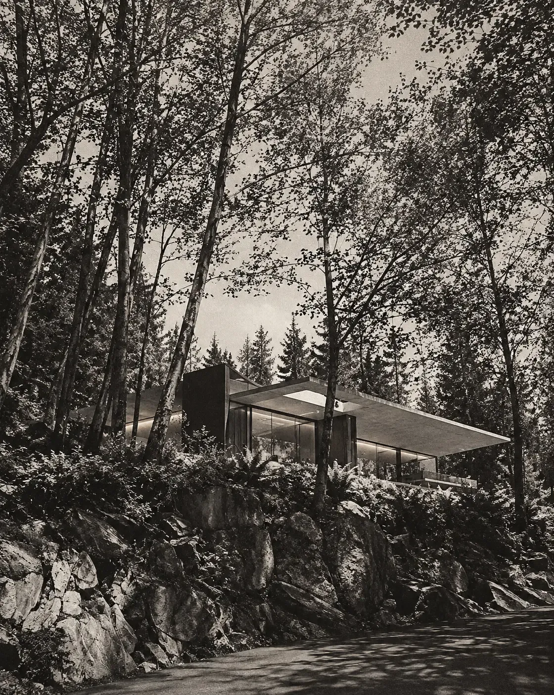
A glass and concrete house on a rocky slope, seen up through tall trees, in black and white.

I started NA Form House so that the best work is recognized as the best work, everywhere it is seen. The gap between what a practice builds and what it shows is the same in every city I have looked at: it opens in the name, the words and the documents, and it can be closed in a season. That is the studio's whole job. It works from Vancouver, across North America. Every practice is read by me and built by the team.

Nazanin Ahmadivafa

Have your brand read

This is the Review: three findings, within five days, free. No call.

Read:

The proposal is read in confidence and never quoted back.

Recognition is a form.

P.S. If you read this far, take the free part. Send a website, a handle and one proposal. In five days you will know the three places your brand is losing you work, and which one to fix first. Most people would rather not know. You read this far.

· Vancouver · working across North America

Reading now. Letters go out within five days.